

系统主题
可获取当前是否处于暗色模式、布局类型、主题颜色等,方便自定义组件的适配
在组件中获取主题
通过useThemeStore.$state 可获取当前主题信息
其中主题颜色获取需通过
antColorPrimary属性进行获取,或调用actions下getColorPrimary()方法进行获取
colorPrimary属性的颜色再暗色模式下没有经过 ant design 的算法调整,会出现色号和全局不统一的问题
<script setup lang="ts">
// 导入 useThemeStore
import {useThemeStore} from "@/stores/theme.ts";
const themeStore = useThemeStore();
// 当前是否处于暗色模式
const isDark = themeStore.$state.isDarkTheme
// 获取当前主题颜色
const colorPrimary = themeStore.$state.antColorPrimary
// 通过方法获取当前主题颜色
const colorPrimary = themeStore.getColorPrimary()
// 获取布局类型
const layoutType = themeStore.$state.layoutType
</script>
主题定义state如下
state() {
    /**
     * 暗色模式
     */
    const isDarkTheme: boolean = settings.isDarkTheme

    /**
     * 顶部栏背景颜色
     */
    const layoutBackgroundColor: string = settings.siderBackgroundColor

    /**
     * 布局类型 sider-header / header-sider / header-content
     */
    const layoutType: string = settings.layoutType

    /**
     * 组件大小 small/ middle / large
     */
    const componentSize: string = settings.componentSize

    /**
     * 导航模式 inline / horizontal
     */
    const siderMode: string = settings.siderMode

    /**
     * 菜单分组
     */
    const siderGroup: boolean = settings.siderGroup

    /**
     * 主要颜色
     * 组件中使用系统颜色不可直接取用该字段
     * 使用下面提供的getColorPrimary()方法进行获取
     */
    const colorPrimary: string = settings.themeConfig.token.colorPrimary

    /**
     * 通过ant提供的theme的主要颜色,针对暗色模式进行了颜色调整
     */
    const antColorPrimary: string = settings.themeConfig.token.colorPrimary

    /**
     * 侧边栏背景颜色
     */
    const siderBackgroundColor: string = settings.layoutBackgroundColor

    /**
     * 磨砂玻璃效果
     */
    const groundGlass: boolean = settings.groundGlass

    /**
     * 固定头部
     */
    const affixHead: boolean = settings.affixHead

    /**
     * 显示多窗口标签
     */
    const showViewTabs: boolean = settings.showViewTabs

    /**
     * 侧边颜色 light / dark
      */
    const siderTheme: string = settings.siderTheme

    /**
     * 侧边宽度
     */
    const siderWith: number = settings.siderWith

    /**
     * 原侧边宽度,用于调整侧边栏时保存临时变量
     */
    const originSiderWith: number = settings.originSiderWith

    /**
     * 切换路由时的过渡动画 zoom / fade / breathe / top / down / switch / trick
     */
    const routeTransition: string = settings.routeTransition

    /**
     * 灰色模式
     */
    const grayModel: string = settings.grayModel

    /**
     * ant 主题配置
     */
    const themeConfig = settings.themeConfig

    return {
        layoutType,
        componentSize,
        showViewTabs,
        isDarkTheme,
        colorPrimary,
        antColorPrimary,
        siderTheme,
        groundGlass,
        affixHead,
        layoutBackgroundColor,
        siderBackgroundColor,
        siderMode,
        siderGroup,
        siderWith,
        originSiderWith,
        routeTransition,
        grayModel,
        themeConfig
    }
}
在css中获取主题
在dom元素html标签中,定义了若干自定义属性,用来标识各种主题属性
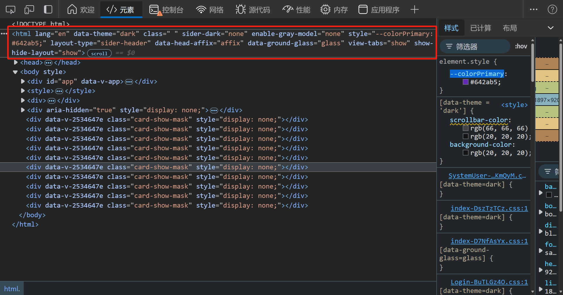
自定义属性
| 属性名称 | 属性描述 |
|---|---|
| data-theme | 全局主题模式(暗色模式:dark,亮色模式:light) |
| sider-dark | 导航栏主题(深色模式:dark,亮色模式:light) |
| enable-gray-model | 全局灰色模式(开启:active,关闭:none) |
| layout-type | 导航样式(侧边导航样式1:sider-header,侧边导航样式2:header-sider,顶部导航:header-content) |
| data-head-affix | 固定头部(固定:affix,不固定:un-affix) |
| data-ground-glass | 高级材质毛玻璃效果(开启:glass,关闭:no-glass) |
| view-tabs | 是否显示多任务栏(显示:show,隐藏:hide) |
| show-hide-layout | 是否显示Layout(显示:show,隐藏:hide) |
组件中使用属性选择器
style标签不可添加scoped否则不会生效
[data-theme = 'dark'] {
    .scrollbar, .sider-scrollbar {
        scrollbar-color: rgb(66,66,66) transparent;
    }
}
[sider-dark = 'dark'] {
    .sider-scrollbar {
        scrollbar-color: rgb(66,66,66) transparent;
    }
}
css 变量
| 变量名 | 变量描述 |
|---|---|
| --colorPrimary | 当前主题颜色(经由ant算法处理,已适配暗色模式) |
.icon-group:hover {
	background: var(--colorPrimary);
}