

可选择卡片
表单中需要单选或多选数据,并需要在选项中描述更多数据内容时使用
基础用法
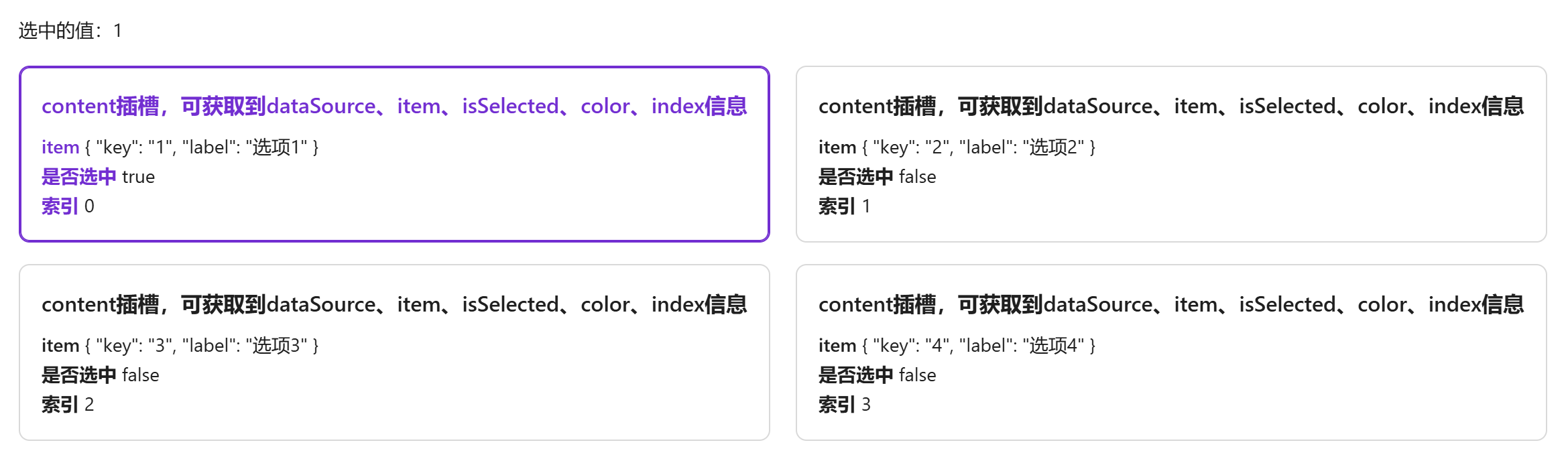
引入组件 import SelectableCard from "@/components/selectable-card/index.vue"后通过data-source定义可选数据,item-key定义双向绑定的值(必须为data-source中的属性)通过v-model进行双向绑定。
卡片内容通过content插槽编写,插槽会返回 {dataSource, item, isSelected, color, index}
vue
<template>
  <a-typography-title :level="4">基础用法</a-typography-title>
  <a-typography strong>选中的值:{{value}}</a-typography>
  <selectable-card :data-source="dataSource" item-key="key" v-model="value">
    <template #content="{dataSource, item, isSelected, color, index}">
      <a-typography-title :level="5" :style="{color: isSelected ? color : ''}">
        content插槽,可获取到dataSource、item、isSelected、color、index信息
      </a-typography-title>
      <div>
        <a-typography-text strong :style="{color: isSelected ? color : ''}">item</a-typography-text> {{item}}
      </div>
      <div>
        <a-typography-text strong :style="{color: isSelected ? color : ''}">是否选中</a-typography-text> {{isSelected}}
      </div>
      <div>
        <a-typography-text strong :style="{color: isSelected ? color : ''}">索引</a-typography-text> {{index}}
      </div>
    </template>
  </selectable-card>
</template>

<script setup lang="ts">
import SelectableCard from "@/components/selectable-card/index.vue"
import {ref} from "vue";
const dataSource = [{
  key: '1',
  label: '选项1'
},{
  key: '2',
  label: '选项2'
},{
  key: '3',
  label: '选项3'
},{
  key: '4',
  label: '选项4'
}]
const value = ref<string>()
</script>
多选卡片
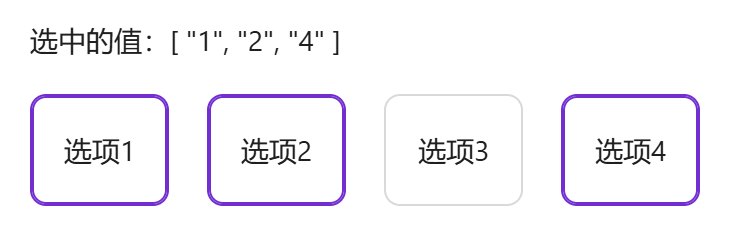
通过multiple可开启多选模式,多选下v-model需绑定为数组
vue
<template>
  <a-typography-title :level="4">可多选</a-typography-title>
  <a-typography strong>选中的值:{{value}}</a-typography>
  <selectable-card :data-source="dataSource" item-key="key" multiple v-model="value">
    <template #content="{ item }">
      {{item.label}}
    </template>
  </selectable-card>
</template>

<script setup lang="ts">
import SelectableCard from "@/components/selectable-card/index.vue"
import {ref} from "vue";
const dataSource = [{
  key: '1',
  label: '选项1'
},{
  key: '2',
  label: '选项2'
},{
  key: '3',
  label: '选项3'
},{
  key: '4',
  label: '选项4'
}]
const value = ref<string[]>([])
</script>
空状态
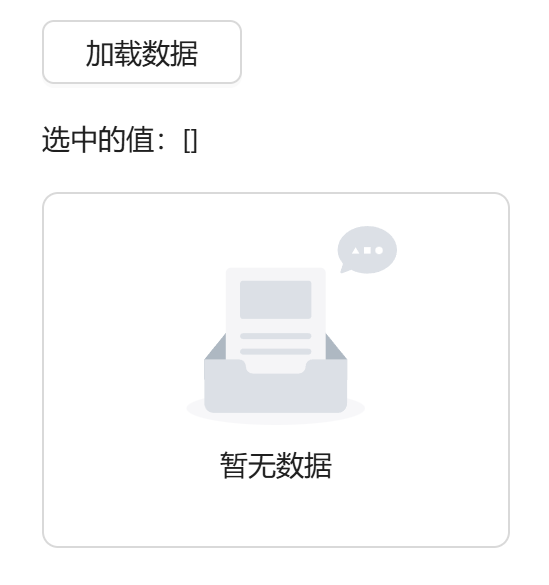
data-source 数据为空时显示空状态
vue
<template>
  <a-typography-title :level="4">加载遮罩及空数据</a-typography-title>
  <a-button @click="handleLoading" style="width: 100px">加载数据</a-button>
  <a-typography strong>选中的值:{{value}}</a-typography>
  <a-row>
    <a-col :span="6">
      <selectable-card :data-source="dataSource" item-key="key" multiple v-model="value" :loading="dataLoading">
        <template #content="{ item }">
          {{item.label}}
        </template>
      </selectable-card>
    </a-col>
  </a-row>
</template>

<script setup lang="ts">
import SelectableCard from "@/components/selectable-card/index.vue"
import {ref} from "vue";
const dataSource = ref<any[]>([])
const dataLoading = ref<boolean>(false)
const value = ref<string[]>([])
const handleLoading = () => {
  dataLoading.value = true
  setTimeout(() => {
    dataSource.value = [{
      key: '1',
      label: '选项1'
    },{
      key: '2',
      label: '选项2'
    },{
      key: '3',
      label: '选项3'
    },{
      key: '4',
      label: '选项4'
    }]
    dataLoading.value = false
  },1500)
}
</script>
API
双向绑定
| 属性名称 | 描述 | 类型 | 默认值 | 是否必填 |
|---|---|---|---|---|
| v-model | 双向绑定 | string(单选)| string[](多选) | - | 是 |
属性
| 属性名称 | 描述 | 类型 | 默认值 | 是否必填 |
|---|---|---|---|---|
| dataSource | 可选的数据列表 | any[] | - | 是 |
| itemKey | dataSource 对象中的唯一值,用作双向绑定 | string | - | 是 |
| multiple | 是否支持多选 | boolean | false | 否 |
| gap | 卡片间距 | number | 16 | 否 |
| cardStyle(1.2.5) | 卡片组件样式 | object | {} | 否 |
| itemStyle | 卡片内元素样式 | object | {} | 否 |
| vertical | 是否垂直排列 | boolean | false | 否 |
| maxHeight | 最大高度 (仅对垂直排列生效) | number | 300 | 否 |
| emptyDescription | 空状态描述文本 | string | - | 否 |
| scrollViewIndex(1.2.5) | 竖向排列出现滚动条时,目标index的元素将始终在可视范围 | number | 0 | 否 |
| loading | 加载中 | boolean | false | 否 |
插槽
| 插槽名称 | 描述 | 参数说明 | 是否必须 |
|---|---|---|---|
| content | 卡片内容 | dataSource:数据集合 item:遍历出的item对象 index:索引 isSelected:是否被选中 color:当前主题颜色 | 是 |
方法
| 方法名称 | 描述 | 参数 |
|---|---|---|
| click | 点击卡片触发 | {activeValueList,item,props} |
| change | 选项变化时触发 | {item} |