

可展开卡片
仪表盘页面用来展示概述和详情时使用
小卡片展示汇总数据,展开后大卡片展示明细/历史/详细数据
组件效果
可以展开/收回的卡片组件,类似手机小组件,提供从哪来回哪去的卡片展示效果,支持页面任意缩放
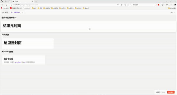
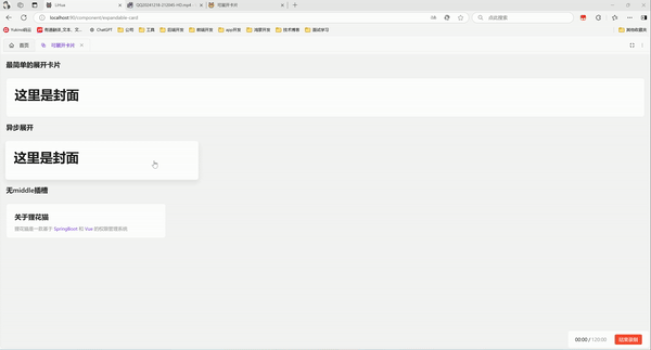
基础用法
引入组件import ExpandableCard from '@/components/expandable-card/index.vue' 后使用overview middle detail 实现最简单的展开卡片
vue
<template>
  <a-typography-title :level="4">最简单的展开卡片</a-typography-title>
  <expandable-card :expanded-height="600" :expanded-width="600" :hover-scale="1.01">
    <template #overview>
      <a-card>
        <a-typography-title>这里是封面</a-typography-title>
      </a-card>
    </template>
    <template #middle>
      <a-card style="width: 100%" :bordered="false">
        <a-typography-title>这里是过渡</a-typography-title>
        <a-typography-title>这里是过渡</a-typography-title>
        <a-typography-title>这里是过渡</a-typography-title>
      </a-card>
    </template>
    <template #detail>
      <a-card>
        <a-typography-title>这里是展开</a-typography-title>
      </a-card>
    </template>
  </expandable-card>
</template>

<script setup lang="ts">
import ExpandableCard from '@/components/expandable-card/index.vue'
</script>
异步展开
设置:auto-complete="false" 后通过is-complete属性来控制卡片是否展开,通常配合异步请求,结果返回后展示详情卡片。通过before-card-expand和after-card-close来控制loadSuccess的值
vue
<template>
<a-typography-title :level="4">异步展开</a-typography-title>
<expandable-card :expanded-height="600"
:expanded-width="600"
:hover-scale="1.01"
:auto-complete="false"
:is-complete="loadSuccess"
@before-card-expand="handleCardClick"
@after-card-close="handleCardReady"
style="width: 30%"
>
<template #overview>
<a-card>
<a-typography-title>
这里是封面
</a-typography-title>
</a-card>
</template>
<template #middle>
<a-card style="width: 100%;">
过渡状态持续1.5s后展示展开卡片
</a-card>
</template>
<template #detail>
<a-card>
<a-typography-title>
这里是展开
</a-typography-title>
</a-card>
</template>
</expandable-card>
</template>
<script setup lang="ts">
import ExpandableCard from '@/components/expandable-card/index.vue'
import {ref} from "vue";
// 控制卡片是否切换到展开状态
const loadSuccess = ref<boolean>(false)
// 处理点击卡片模拟异步请求
const handleCardClick = () => {
setTimeout(() => {
loadSuccess.value = true
}, 1500)
}
// 关闭卡片
const handleCardReady = () => {
loadSuccess.value = false
}
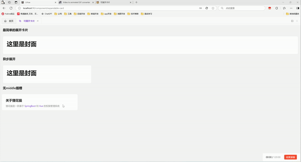
</script>无middle插槽
不使用middle插槽,会直接使用detail进行中间过渡,适合纯静态detail并detail中元素不多的场景
vue
<template>
  <a-typography-title :level="4">无middle插槽</a-typography-title>
  <a-row>
    <a-col :span="6">
      <expandable-card
          style="width: 100%"
          :hover-scale="1.03"
          :expanded-width="600"
          :expanded-height="610"
          :middle-style="{'background':themeStore.$state.isDarkTheme ? '#141414': '#fff','background-size': 'contain','border-radius':' 8px'}"
      >
        <template #overview>
          <a-card :body-style="{height: '100px'}" class="card-background">
            <a-typography-title :level="4" ellipsis>关于狸花猫</a-typography-title>
            <a-typography-text ellipsis type="secondary">
              <a-typography-text type="secondary">狸花猫是一款基于</a-typography-text>
              <a-typography-text :style="{color:themeStore.getColorPrimary()}"> SpringBoot </a-typography-text>
              <a-typography-text type="secondary">和</a-typography-text>
              <a-typography-text :style="{color:themeStore.getColorPrimary()}"> Vue </a-typography-text>
              <a-typography-text type="secondary">的权限管理系统</a-typography-text>
            </a-typography-text>
          </a-card>
        </template>
        <template #detail>
          <a-card class="card-background" id="test">
            <a-typography-title :level="4" ellipsis>关于狸花猫</a-typography-title>
            <a-typography-text ellipsis type="secondary">
              <a-typography-text type="secondary">狸花猫是一款基于</a-typography-text>
              <a-typography-text :style="{color:themeStore.getColorPrimary()}"> SpringBoot </a-typography-text>
              <a-typography-text type="secondary">和</a-typography-text>
              <a-typography-text :style="{color:themeStore.getColorPrimary()}"> Vue </a-typography-text>
              <a-typography-text type="secondary">的权限管理系统</a-typography-text>
            </a-typography-text>
            <div class="scrollbar" style="height: 484px;margin-top: 16px;overflow-x: hidden">
              <a-typography-title :level="5">
                为什么叫狸花猫
              </a-typography-title>
              <a-typography-title :level="5">
                系统功能
              </a-typography-title>
              <a-typography-text>
                <p style="text-indent: 2em">
                  系统包含完整的基于角色控制的 RBAC 权限管理系统,包括菜单管理、角色管理和用户管理。此外,还提供部门和岗位管理,适用于大多数业务场景,用户支持多部门并可指定默认部门,前后端均提供接口获取用户的默认信息。
                </p>
              </a-typography-text>
              <a-typography-title :level="5">
                字典管理
              </a-typography-title>
              <a-typography-text>
                <p style="text-indent: 2em">
                  系统字典支持普通字典和树形字典,并提供工具类用于获取和翻译字典信息,前端还提供 dict-tag 组件,可以通过字典 value 直接展示字典 label,并自动匹配 tag 样式。
                </p>
              </a-typography-text>
              <a-typography-title :level="5">
                通知公告
              </a-typography-title>
              <a-typography-text>
                <p style="text-indent: 2em">
                  通知公告集成了 Vditor 富文本解析器,并使用 SSE 实现了消息的实时发送与接收。
                </p>
              </a-typography-text>
              <a-typography-title :level="5">
                个人中心
              </a-typography-title>
              <a-typography-text>
                <p style="text-indent: 2em">
                  个人中心支持个性化系统主题配置,支持主题、布局、导航等页面设置。
                </p>
              </a-typography-text>
              <a-typography-title :level="5">
                系统设置
              </a-typography-title>
              <a-typography-text>
                <p style="text-indent: 2em">
                  管理员角色用户可以对系统进行进一步配置,包括默认密码设置、定期修改密码、同账号登录限制、自助注册配置、验证码开关、IP 黑名单和灰色模式。
                </p>
              </a-typography-text>
              <a-typography-title :level="5">
                其他功能
              </a-typography-title>
              <a-typography-text>
                <p style="text-indent: 2em">
                  系统还提供了日志服务、在线用户监控、缓存监控、服务监控以及定时任务等功能。
                </p>
              </a-typography-text>
            </div>
          </a-card>
        </template>
      </expandable-card>
    </a-col>
  </a-row>
</template>
<script setup lang="ts">
import ExpandableCard from "@/components/expandable-card/index.vue";
import {useThemeStore} from "@/stores/theme.ts";
const themeStore = useThemeStore();
</script>
<style scoped>
.card-background {
  background-position-y: 10px;
  background-position-x: calc(100% - 10px);
  background-repeat: no-repeat;
  background-size: 36px 36px;
}
</style>
API
属性
| 属性名称 | 描述 | 类型 | 默认值 | 是否必填 |
|---|---|---|---|---|
| expandedWidth | 展开后宽度 | number | - | 是 |
| expandedHeight | 展开后高度 | number | - | 是 |
| expandedTop | 展开后距离页面顶端像素 | number | 100 | 否 |
| hoverScale | 鼠标悬浮缩略卡片缩放倍率 | number | 1.05 | 否 |
| autoComplete | 中间过渡完成后自动切换到展开状态(异步调用时配合isComplete使用) | boolean | true | 否 |
| isComplete | 中间过渡完成后是否切换到展开状态(异步调用时配合autoComplete使用) | boolean | - | 否 |
| isDetailVisible | 是否展示详情(设置为false后,无法点击卡片展开) | boolean | true | 否 |
| minWindowSpace | 窗口缩小时的最小间距(窗口缩小到比展开卡片小时,卡片周围到浏览器视口的距离,类似margin) | number | 16 | 否 |
插槽
| 插槽名称 | 描述 | 是否必须 |
|---|---|---|
| overview | 卡片展开前显示的内容 | 是 |
| middle | 卡片展开时显示的内容(没有使用该插槽默认以detail过渡) | 否 |
| detail | 卡片展开后显示的内容 | 是 |
方法
| 方法名称 | 描述 | 参数 |
|---|---|---|
| cardClick | 点击小卡片触发 | detailVisible:boolean卡片是否可展开 |
| beforeCardExpand | 卡片展开前触发(卡片就绪状态下点击卡片触发) | - |
| afterCardExpand | 卡片展开前触后(卡片展开完成后触发) | - |
| beforeCardClose | 卡片关闭前触发(卡片展开状态下触发关闭时触发) | - |
| afterCardClose | 卡片关闭后触发(卡片关闭完成后触发) | - |
| onMouseEnter | 鼠标移入卡片时触发 | - |
| onMouseLeave | 鼠标移出卡片时触发 | - |