

全屏遮罩
Mask 组件适合在自定义弹窗等组件中遮挡背景使用
Spin 适合在ts中进行耗时操作时加载动效缓解用户焦虑
Mask遮罩基础用法
引入组件import Mask from "@/components/mask/index.vue后通过show-mask属性控制是否显示遮罩

vue
<template>
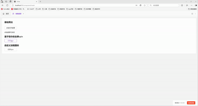
<a-typography-title :level="4">基础用法</a-typography-title>
<a-button @click="showMask = true" style="width: 120px">点击打开遮罩</a-button>
<a-typography-text>点击遮罩可关闭</a-typography-text>
<Mask :show-mask="showMask" @click="showMask = false"/>
</template>
<script setup lang="ts">
import Mask from "@/components/mask/index.vue"
import {ref} from "vue";
const showMask = ref<boolean>(false)
</script>Spin基础用法
因ant-design-vue官方spin组件不支持通过服务方式调用,看到互联网大佬做了对应的实现后集成到了系统中
引入组件import Spin from '@/components/spin' 后通过Spin.service()可打开遮罩,返回spin实例,可调用关闭遮罩
vue
<template>
  <div>
    <a-typography-title :level="4">基于指令的全屏spin</a-typography-title>
    <a-button @click="openSpin" style="width: 120px">打开Spin</a-button>
  </div>
</template>

<script setup lang="ts">
import Spin from '@/components/spin';
// 打开全屏加载并在1.5s后关闭
const openSpin = () => {
  const spin = Spin.service({
    tip: '1.5秒后关闭',
  })
  setTimeout(() => {
    spin.close()
  },1500)
}
</script>
Spin修改加载图标
Spin组件支持官方属性,参考ant-design-vue官方文档可进行调整

vue
<template>
  <div>
    <a-typography-title :level="4">自定义加载图标</a-typography-title>
    <a-button @click="openSpin" style="width: 120px">打开Spin</a-button>
  </div>
</template>

<script setup lang="ts">
import Spin from '@/components/spin';
import {LoadingOutlined} from "@ant-design/icons-vue";
import { h } from 'vue';
const indicator = h(LoadingOutlined, {
  style: {
    fontSize: '24px',
  },
  spin: true,
});
// 打开全屏加载并在1.5s后关闭
const openSpin = () => {
  const spin = Spin.service({
    tip: '1.5秒后关闭',
    indicator: indicator,
  })
  setTimeout(() => {
    spin.close()
  },1500)
}
</script>
API
Mask属性
| 属性名称 | 描述 | 类型 | 默认值 | 是否必填 |
|---|---|---|---|---|
| showMask | 显示遮罩 | boolean | - | 是 |
| zIndex | 层级 | number | 1000 | 否 |
Mask方法
| 方法名称 | 描述 | 参数 |
|---|---|---|
| click | 点击遮罩时触发 | KeyboardEvent | MouseEvent , 'mask' |
Spin属性
| 属性名称 | 描述 | 类型 | 默认值 | 是否必填 |
|---|---|---|---|---|
| tip | 显当作为包裹元素时,可以自定义描述文案 | string | slot | - | 否 |
| delay | 延迟显示加载效果的时间(防止闪烁) | number | - | 否 |
| indicator | 加载指示符 | vNode|slot | - | 否 |
| spinning | 是否为加载中状态 | boolean | true | 否 |
| wrapperClassName | 包装器的类属性 | string | - | 否 |
| size | 组件大小 | small | default | large | default | 否 |
详见官方文档
Spin实例
| 方法名称 | 描述 |
|---|---|
| close() | 关闭Spin |