

自定义图标
图标支持Ant Design Vue 4.0官方图标及自定义图标
官方图标
官方案例在组件中使用图标需要将对应的图标组件进行导入,在实际开发中有些繁琐。在本项目main.ts 中对官方图标进行了全局组件注册,在组件中的图标使用上更加便利
// andv 图标
import * as Icons from "@ant-design/icons-vue";
// ant 自带图标
const icons:Record<string, Component> = Icons
for (const i in icons) {
    app.component(i,icons[i])
}
自定义图标
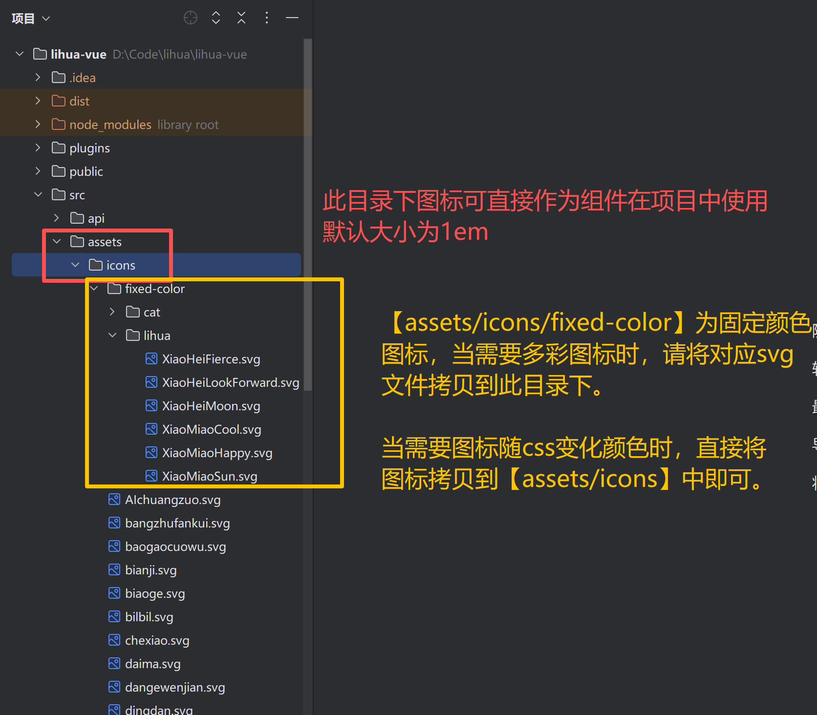
当官方图标不足以满足业务需求时,可创建自定义图标组件。在本项目main.ts 中对 src/assets/icons 下的svg文件识别为图标组件,直接将svg文件拷贝到该文件夹下,即可像官方图标一样使用
提示
项目中使用了 vite 插件来对 src/assets/icons 下的svg 文件进行编辑,使其能被css控制改变颜色;对于指定好颜色的彩色图标,可放在src/assets/icons/fixed-color 目录下,颜色不会被css改变
项目中使用图标
具体图标使用方法请参考官方文档项目中自定义图标用法与官方相同,下面例句中在项目中的简单用法
直接使用图标组件:无需引入组件,直接在vue模板中使用图标组件名标签
<a-button type="primary" @click="handleModelStatus('新增用户')">
  <template #icon>
    <PlusOutlined />
  </template>
  新 增
</a-button>
使用vue
component组件:在 component 的 is 属性直接传入图标组件名<a-button type="primary" @click="handleModelStatus('新增用户')"> <template #icon> <component is="PlusOutlined"/> </template> 新 增 </a-button>使用项目提供
Icon组件:引入import Icon from "@/components/icon/index.vue"后传入icon属性为组件名<a-button type="primary" @click="handleModelStatus('新增用户')"> <template #icon> <icon icon="PlusOutlined"/> </template> 新 增 </a-button> <script setup lang="ts"> // 引入提供的icon组件 import Icon from "@/components/icon/index.vue" </script>