

图标选择
表单中需要选择图标时使用
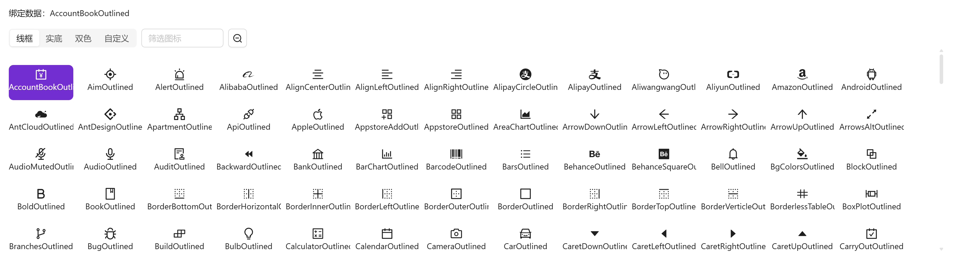
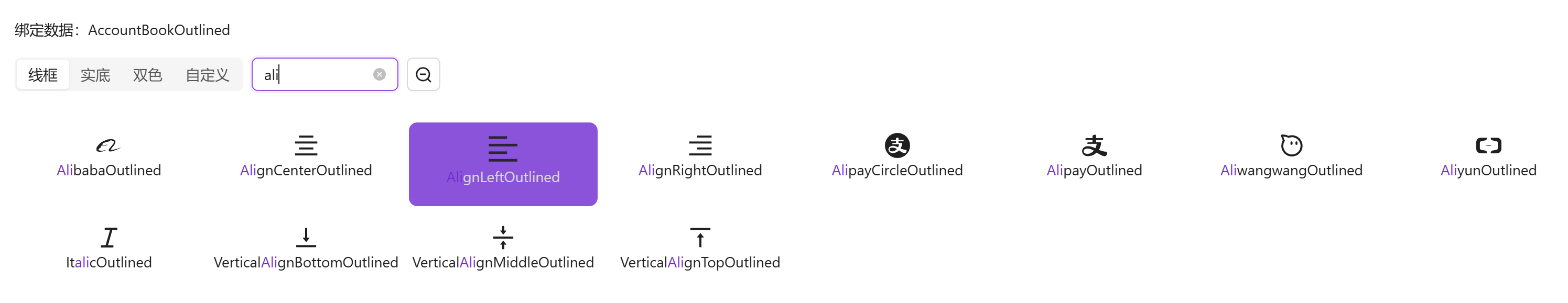
基础用法
引入组件import IconSelect from "@/components/icon-select/index.vue" 绑定v-model使用
vue
<template>
<a-typography-title :level="4">基础用法</a-typography-title>
<a-typography-text>绑定数据:{{value}}</a-typography-text>
<icon-select v-model="value"/>
</template>
<script setup lang="ts">
import IconSelect from "@/components/icon-select/index.vue"
import {ref} from "vue";
const value = ref<string>()
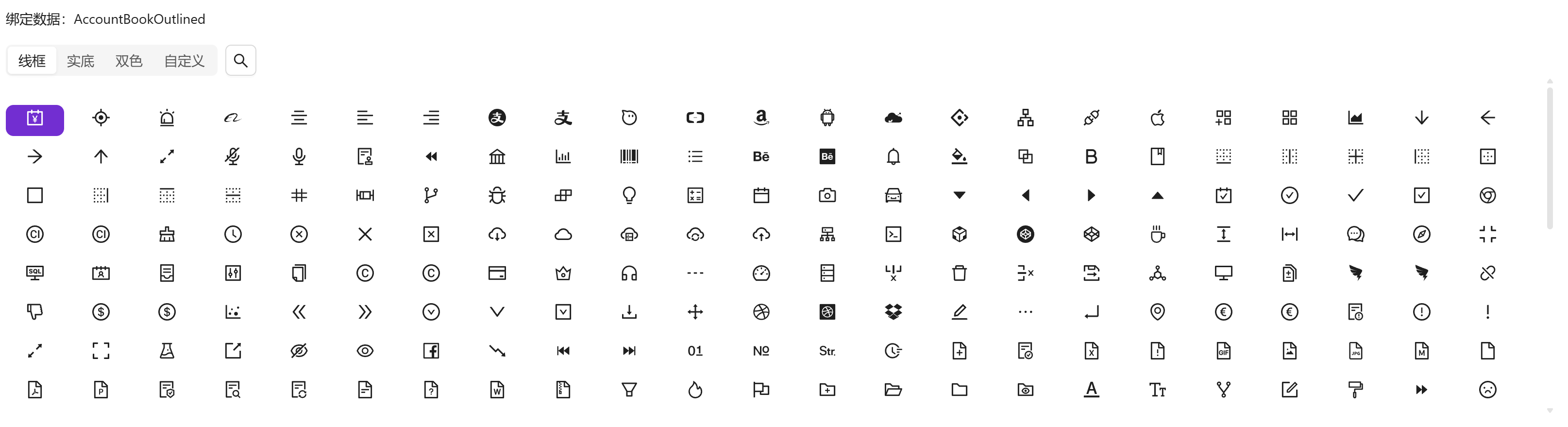
</script>大号组件
通过size属性可修改组件中图标大小,以适应不同容器
vue
<template>
  <a-typography-title :level="4">大号组件</a-typography-title>
  <a-typography-text>绑定数据:{{value}}</a-typography-text>
  <icon-select v-model="value" size="large"/>
</template>

<script setup lang="ts">
import IconSelect from "@/components/icon-select/index.vue"
import {ref} from "vue";
const value = ref<string>()
</script>
小号组件
小号组件隐藏了组件名称,适合在 a-popover 等小型弹窗下使用
vue
<template>
  <a-typography-title :level="4">小号组件</a-typography-title>
  <a-typography-text>绑定数据:{{value}}</a-typography-text>
  <icon-select v-model="value" size="small"/>
</template>

<script setup lang="ts">
import IconSelect from "@/components/icon-select/index.vue"
import {ref} from "vue";
const value = ref<string>()
</script>
API
双向绑定
| 属性名称 | 描述 | 类型 | 默认值 | 是否必填 |
|---|---|---|---|---|
| v-model | 双向绑定 | string | - | 是 |
属性
| 属性名称 | 描述 | 类型 | 默认值 | 是否必填 |
|---|---|---|---|---|
| maxHeight | 图标容器高度(例:400px) | string | - | 否 |
| width | 图标容器宽度(例:100%) | string | - | 否 |
| size | 图标尺寸 | small | large | default | default | 否 |
方法
| 方法名称 | 描述 | 参数 |
|---|---|---|
| click | 点选图标时触发 | 选中的图标组件名 |