

系统主题
3.0 主题体系围绕「双事实源」设计:亮暗档位(外观模式)以浏览器 localStorage 为唯一事实源(跟浏览器走不跟账号走);其余主题配置(主题色、圆角、布局、磨砂玻璃、多标签、页脚、路由动画、点击效果等)以服务端为唯一事实源(跟账号走),登录后从服务端拉取、变更后防抖回存。可获取当前是否处于暗色模式、布局类型、主题颜色等,方便自定义组件的适配
外观模式(亮暗档位)
外观模式为三档配置态:light(亮色)/ dark(暗色)/ auto(跟随系统偏好),持久化在 localStorage['theme-mode']:
- 手动切档立即写入 localStorage;
auto档由系统偏好prefers-color-scheme实时推导实际态 - 登录后从服务端加载主题时,档位仍只认 localStorage(服务端主题 JSON 中的同名键被序列化时剔除,不随账号走)
- 同源多窗口之间通过
storage事件感知档位变化:任一窗口切档,其他窗口即时跟随(自身写入不触发 storage 事件,天然无回环) - 页面顶栏内置
theme-mode-segmented三档切换组件,可直接使用:
<template>
  <!-- translucent:玻璃/透明底面场景开启半透明样式 -->
  <theme-mode-segmented :translucent="false"/>
</template>

<script setup lang="ts">
// 组件为全局注册,可直接使用;也可显式引入
// import ThemeModeSegmented from "@/components/theme-mode-segmented/index.vue"
</script>| 属性名称 | 描述 | 类型 | 默认值 | 是否必填 |
|---|---|---|---|---|
| translucent | 是否使用半透明玻璃样式(用于玻璃/透明底面场景) | boolean | false | 否 |
暗色算法经 antdv-next 的 theme.darkAlgorithm / theme.defaultAlgorithm 提供,由应用根组件 <a-config-provider :theme="themeStore.themeConfig"> 响应式生效,无需手动切换组件样式。
服务端主题(唯一事实源)
登录后 app-init.ts 的 initApp 调用 themeStore.init(userInfo.theme),以服务端下发的主题 JSON 全量初始化 store;此后任意主题变更经 userStore 挂接的防抖同步(800ms)回存服务端(saveTheme,与已知服务端值相同则静默跳过),避免拖动色板/圆角等连续调整产生高频请求。登出不保存主题并拆除同步(防抖窗口内未发出的变更随之丢弃——主题为非关键数据)。
服务端保存与跨窗广播共用同一序列化形态(serializeThemeState,剔除窗口尺寸等运行时字段),保证字符串可直接比较。
跨窗同步
主窗与画中画小窗之间通过 BroadcastChannel('theme-sync') 全量广播:变更经 100ms 防抖广播,接收方经 init 重放(算法/html 属性/主题色全量落地),接收期间的变更不回播,防消息回环。
主题色候选
主题色提供 8 色候选(settings.colorOptions:拂晓蓝/薄暮/火山/日暮/明青/极光绿/极客蓝/酱紫),主题色变更后落地为:
themeConfig.token.colorPrimary:经 ConfigProvider 驱动 antdv-next 全部组件- CSS 变量
--colorPrimary:供纯 CSS 消费 - store 字段
antColorPrimary:供模板/JS 响应式消费(暗色模式下经算法调整)
灰色模式
灰色模式(哀悼等场景全站置灰)为管理员级全局配置,由 setting store 从服务端拉取(enableGrayMode),经 html 属性 gray-model="enable" 生效,不随用户主题重置。
在组件中获取主题
通过useThemeStore.$state 可获取当前主题信息
其中主题颜色获取需通过
antColorPrimary属性进行获取,或调用actions下getColorPrimary()方法进行获取
colorPrimary属性的颜色在暗色模式下没有经过算法调整,会出现色号和全局不统一的问题
<script setup lang="ts">
// 导入 useThemeStore
import {useThemeStore} from "@/stores/theme.ts";
const themeStore = useThemeStore();
// 当前是否处于暗色模式(实际态:auto 时由系统偏好推导)
const isDark = themeStore.$state.isDarkTheme
// 通过方法获取当前主题颜色
const colorPrimary = themeStore.getColorPrimary()
// 获取布局类型
const layoutType = themeStore.$state.layoutType
</script>
主题定义state如下
state() {
    /**
     * 外观模式(配置态):light / dark 手动指定,auto 跟随系统
     */
    const themeMode: ThemeMode = settings.themeMode

    /**
     * 当前明暗(实际态):auto 时由系统偏好推导,手动时等于配置
     */
    const isDarkTheme: boolean = settings.isDarkTheme

    /**
     * 布局类型 side-navigation / mix-navigation / top-navigation
     */
    const layoutType: string = settings.layoutType

    /**
     * 组件大小 small/ middle / large
     */
    const componentSize: string = settings.componentSize

    /**
     * 菜单分组
     */
    const siderGroup: boolean = settings.siderGroup

    /**
     * 主要颜色
     * 组件中使用系统颜色不可直接取用该字段
     * 使用下面提供的getColorPrimary()方法进行获取
     */
    const colorPrimary: string = settings.themeConfig.token.colorPrimary

    /**
     * 通过ant提供的theme的主要颜色,针对暗色模式进行了颜色调整
     */
    const antColorPrimary: string = settings.themeConfig.token.colorPrimary

    /**
     * 界面圆角(同步进 themeConfig.token 生效,派生圆角 token 自动跟随)
     */
    const borderRadius: number = settings.themeConfig.token.borderRadius

    /**
     * 磨砂玻璃效果
     */
    const groundGlass: boolean = settings.groundGlass

    /**
     * 固定头部
     */
    const affixHead: boolean = settings.affixHead

    /**
     * 显示多窗口标签
     */
    const showViewTabs: boolean = settings.showViewTabs

    /**
     * 显示页脚
     */
    const showFooter: boolean = settings.showFooter

    /**
     * 侧边颜色 light / dark
      */
    const siderTheme: string = settings.siderTheme

    /**
     * 侧边宽度
     */
    const siderWith: number = settings.siderWith

    /**
     * 是否为小尺寸窗口
     */
    const isSmallWindow: boolean = false

    /**
     * 是否为画中画小窗(URL 携带 miniWindow=true 的 iframe 宿主)
     */
    const isMiniWindow: boolean = window.location.href.includes("miniWindow=true")

    /**
     * 原侧边宽度,用于调整侧边栏时保存临时变量
     */
    const originSiderWith: number = settings.originSiderWith

    /**
     * 切换路由时的过渡动画 zoom / pop / fade / blur / slide-right / slide-left / slide-up / slide-down
     */
    const routeTransition: string = settings.routeTransition

    /**
     * 点击效果 none / wave / inset / shake / happy
     * happy 为快乐工作点击特效(@antdv-next/happy-work-theme 官方包)
     */
    const clickEffect: ClickEffect = settings.clickEffect

    /**
     * 灰色模式
     */
    const grayModel: boolean = settings.grayModel

    /**
     * ant 主题配置
     */
    const themeConfig = { ...settings.themeConfig, token: { ...settings.themeConfig.token } }

    /**
     * 是否从服务端加载完毕
     * 系统主题默认从settings中读取默认值,用户登录后会从服务器获取用户定义的主题信息
     * 当获取到服务器主题后会将此属性设置为 true
     */
    const isServerLoad = false

    return {
        layoutType,
        componentSize,
        showViewTabs,
        showFooter,
        themeMode,
        isDarkTheme,
        colorPrimary,
        antColorPrimary,
        borderRadius,
        siderTheme,
        groundGlass,
        affixHead,
        isSmallWindow,
        isMiniWindow,
        siderGroup,
        siderWith,
        originSiderWith,
        routeTransition,
        clickEffect,
        grayModel,
        themeConfig,
        isServerLoad
    }
}
主题设置页
主题相关的全部配置项(外观模式、主题色、界面圆角、导航布局、磨砂玻璃、路由动画、点击效果等)在「系统设置」页面维护,配置变更即时生效并自动回存服务端:
在css中获取主题
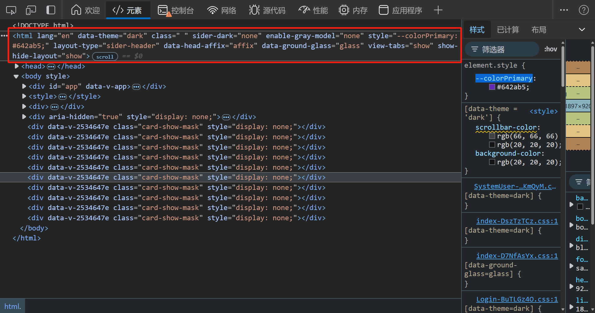
在dom元素html标签中,定义了若干自定义属性,用来标识各种主题属性
自定义属性
| 属性名称 | 属性描述 |
|---|---|
| data-theme | 全局主题模式(暗色模式:dark,亮色模式:light) |
| ground-glass | 是否开启毛玻璃模式(开启:enable) |
| gray-model | 是否开启灰色模式(开启:enable) |
组件中使用属性选择器
style标签不可添加scoped否则不会生效
[data-theme = 'dark'] {
    .scrollbar, .sider-scrollbar {
        scrollbar-color: rgb(66,66,66) transparent;
    }
}
css 变量
| 变量名 | 变量描述 |
|---|---|
| --colorPrimary | 当前主题颜色(经由ant算法处理,已适配暗色模式) |
| --ant-* | antdv-next 运行时注入的主题 token(Unocss 原子类的取值来源) |
.icon-group:hover {
	background: var(--colorPrimary);
}
更多css变量在 src/static/css/variable.css 中进行维护,包含玻璃材质、alpha 遮罩、布局常量(--content-height 内容区可用高度公式)、滚动条、页面底色等自有变量(--ant-* token 之外的部分):
/* 亮色模式变量 */
:root {
    /* ======================主题颜色 会由ts进行覆盖======================== */
    --colorPrimary: rgba(0, 0, 0, 0);

    /* ===============================模糊=============================== */
    --lihua-backdrop-filter-lg: saturate(180%) blur(20px);
    --lihua-backdrop-filter-md: saturate(180%) blur(12px);
    --lihua-backdrop-filter-sm: saturate(180%) blur(6px);

    /* =========================模糊状态下背景颜色========================= */
    --lihua-backdrop-filter-on-color: rgba(255,255,255,0.6);
    --lihua-backdrop-filter-off-color: rgba(255,255,255,1);

    /* ============================layout高度============================ */
    --lihua-layout-height: 48px;

    /* =========================layout头部元素间距========================= */
    --lihua-layout-head-space: 32px;

    /* =============================深色菜单============================== */
    --lihua-sider-dark-color: rgba(0,21,41);

    /* ===============================页脚=============================== */
    --footer-height: 32px;

    /* ====================内容区高度状态(store 切换时直写覆盖)=================== */
    --footer-display-height: var(--footer-height);
    --tab-display-height: 54px;
    --layout-display-height: var(--lihua-layout-height);

    /* ====================内容区可用高度(满高列表页消费)==================== */
    --layout-header-height: 0px;
    --content-space: 16px;
    --content-height: calc(100vh - var(--layout-header-height) - var(--content-space) - max(var(--content-space), var(--footer-display-height)));

    /* ==============================滚动条============================== */
    --lihua-scrollbar-thumb-color: rgb(227,227,227) transparent;
    --lihua-sider-scrollbar-thumb-color: rgb(66,66,66) transparent;

    /* ===============================背景颜色=============================== */
    --lihua-background-color-level-1: #f5f5f5;

    /* ==============================透明度颜色============================== */
    --lihua-alpha-0: rgba(255,255,255,0);
    --lihua-alpha-2: rgba(255,255,255,0.08);
    --lihua-alpha-4: rgba(255,255,255,0.45);
    --lihua-alpha-5: rgba(255,255,255,0.65);
    --lihua-alpha-6: rgba(255,255,255,0.88);
}

/* 暗色模式变量 */
[data-theme = 'dark'] {
    /* =========================模糊状态下背景颜色========================= */
    --lihua-backdrop-filter-on-color: rgba(20,20,20,0.6);
    --lihua-backdrop-filter-off-color: rgba(20,20,20,1);

    /* ==============================滚动条============================== */
    --lihua-scrollbar-thumb-color: rgb(66,66,66) transparent;
    --lihua-sider-scrollbar-thumb-color: rgb(66,66,66) transparent;
}