

可展开卡片
仪表盘页面用来展示概述和详情时使用
小卡片展示汇总数据,展开后大卡片展示明细/历史/详细数据
组件效果
可以展开/收回的卡片组件,类似手机小组件,提供从哪来回哪去的弹簧飞行效果(阻尼弹簧动画,支持中途打断续跑),支持页面任意缩放。3.0 起动画引擎迁移至 Web Animations API 并重新调校了弹簧手感
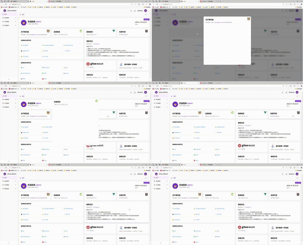
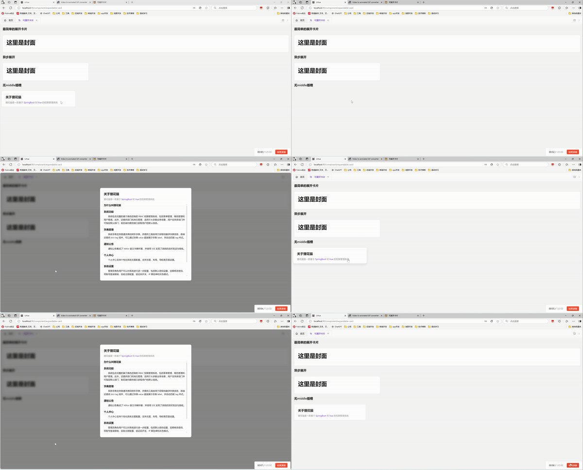
基础用法
引入组件import ExpandableCard from '@/components/expandable-card/index.vue' 后使用overview detail 插槽实现最简单的展开卡片。插槽内容按契约只管满铺背景与排版,不写圆角/边框/阴影(表面由组件常驻提供)
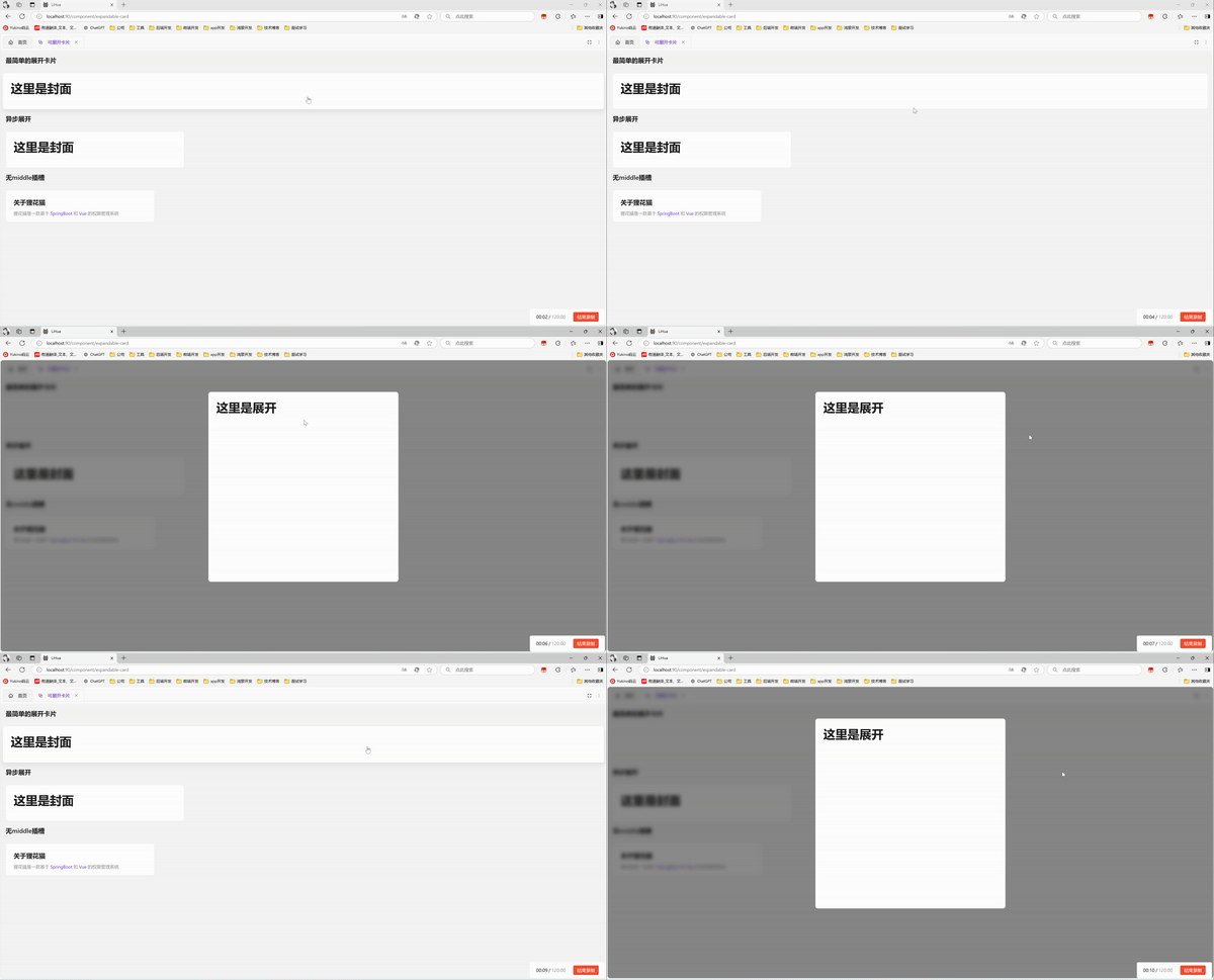
3.0 起展开层为 overview → detail 两层结构(无独立过渡层),封面在交接点直接与详情相交渐变;纯静态 detail 的直接过渡效果如下
<template>
  <a-typography-title :level="4">基础用法</a-typography-title>
  <expandable-card :expanded-width="600" :expanded-height="610">
    <template #overview>
      <!-- 封面:标题 + 主题色关键词描述 + 右上角图标点缀 -->
      <div class="face">
        <div class="min-w-0">
          <a-typography-title :level="4" ellipsis>关于狸花猫</a-typography-title>
          <a-typography-text ellipsis type="secondary">
            基于
            <a-typography-text :style="{color: themeStore.getColorPrimary()}"> SpringBoot </a-typography-text>
            和
            <a-typography-text :style="{color: themeStore.getColorPrimary()}"> Vue </a-typography-text>
            的权限管理系统
          </a-typography-text>
        </div>
        <rocket-outlined class="face-icon" :style="{color: themeStore.getColorPrimary()}"/>
      </div>
    </template>
    <template #detail>
      <div class="scrollbar p-ant-lg">
        <a-typography-title :level="4" ellipsis>这里是展开</a-typography-title>
        <a-typography-text>详情内容,首个子元素会被自动加上滚动条样式并钉最终高度</a-typography-text>
      </div>
    </template>
  </expandable-card>
</template>

<script setup lang="ts">
import ExpandableCard from '@/components/expandable-card/index.vue'
import {RocketOutlined} from '@antdv-next/icons'
import {useThemeStore} from '@/stores/theme.ts'

const themeStore = useThemeStore()
</script>
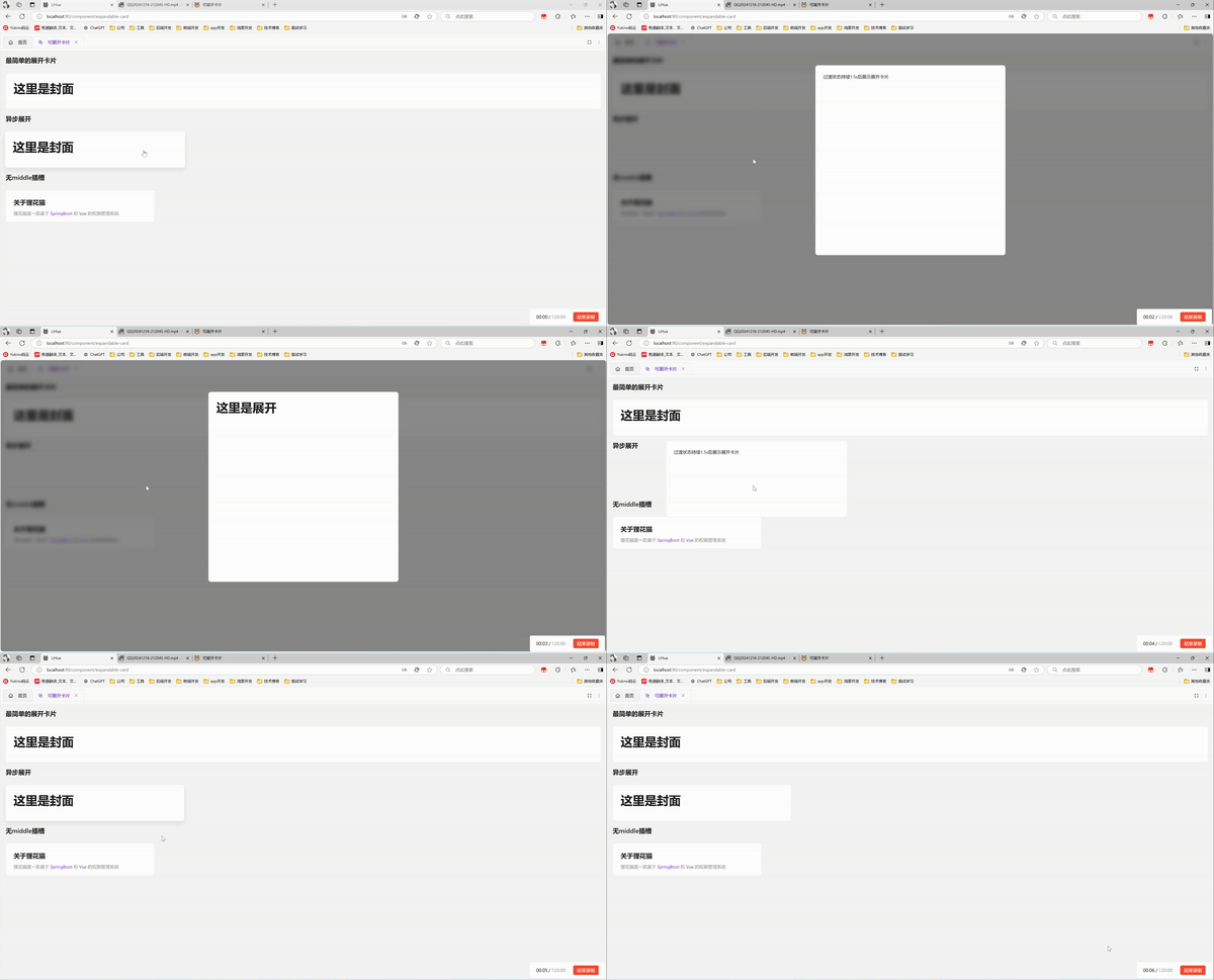
异步展开
设置:auto-complete="false" 后展开动画播完会停在等待层(默认居中 a-spin),由外部通过 is-complete 控制内容就绪(通常配合异步请求,结果返回后置 true)。通过 before-card-expand 发起请求、after-card-close 中复位 isComplete 供下一轮复用;可通过 #loading 插槽自定义等待层内容
<template>
  <a-typography-title :level="4">异步展开</a-typography-title>
  <expandable-card class="w-[300px]"
                   :expanded-width="600"
                   :expanded-height="400"
                   :auto-complete="false"
                   :is-complete="loadSuccess"
                   @before-card-expand="loadData"
                   @after-card-close="resetLoad"
  >
    <template #overview>
      <div class="stat-card">
        <div class="stat-card-name">今日订单</div>
        <div class="stat-card-value">3,128</div>
      </div>
    </template>
    <template #detail>
      <div class="scrollbar p-ant-lg">
        <a-typography-title :level="4">今日订单概览</a-typography-title>
      </div>
    </template>
    <!-- 自定义等待层:不传该插槽时默认居中展示 a-spin -->
    <template #loading>
      <a-flex vertical align="center" :gap="12">
        <a-spin size="large"/>
        <a-typography-text type="secondary">正在加载喵…</a-typography-text>
      </a-flex>
    </template>
  </expandable-card>
</template>

<script setup lang="ts">
import ExpandableCard from '@/components/expandable-card/index.vue'
import {ref} from "vue";
// 控制卡片是否切换到展开状态
const loadSuccess = ref<boolean>(false)
// 处理点击卡片模拟异步请求
const loadData = () => {
  setTimeout(() => {
    loadSuccess.value = true
  }, 1500)
}
// 关闭卡片后复位,供下一轮展开复用
const resetLoad = () => {
  loadSuccess.value = false
}
</script>
静态卡片
设置 :is-detail-visible="false" 后卡片不具备展开能力(点击仅抛出 cardClick 事件,无键盘语义、不进 tab 序),elevated 缺省时跟随此值自动去掉阴影与悬停上浮;显式传入 :elevated 可解耦覆盖(如可展开但不浮起、或静态卡仍要浮起)。bordered 可关闭边框(底色/圆角/阴影恒走主题 token)
受控展开
v-model:expanded 由外部驱动开合(类似 Modal 的 open):置 true 展开、置 false 关闭,挂载时携带 true 亦会直接展开;点击/Esc/蒙版等内部触发同样会经 update:expanded 回写同步状态
<template>
  <a-button @click="expanded = !expanded">外部控制展开/关闭</a-button>
  <expandable-card :expanded-width="600" :expanded-height="400" v-model:expanded="expanded">
    <template #overview>封面</template>
    <template #detail>详情</template>
  </expandable-card>
</template>

<script setup lang="ts">
import {ref} from "vue";
const expanded = ref<boolean>(false)
</script>
API
属性
| 属性名称 | 描述 | 类型 | 默认值 | 是否必填 |
|---|---|---|---|---|
| expandedWidth | 展开后的宽度(可展开卡必配:缺失时点击展开被拒绝并告警;静态卡可免填) | number | 0 | 是 |
| expandedHeight | 展开后的高度(同 expandedWidth) | number | 0 | 是 |
| expandedTop | 展开后距离页面顶端像素 | number | 100 | 否 |
| stretch | overview 过渡期贴合方式:true 拉伸填满容器(适合整面背景卡片);false 等比缩放(适合纯文字内容卡片) | boolean | true | 否 |
| autoComplete | 展开动画结束后是否直接显示 detail(异步调用时配合 isComplete 使用) | boolean | true | 否 |
| isComplete | autoComplete 为 false 时,置 true 触发 loading 渐隐、detail 渐显;关闭后应由外部在 afterCardClose 中复位 | boolean | - | 否 |
| isDetailVisible | 是否可展开(false 即静态卡,点击仅抛 cardClick 事件) | boolean | true | 否 |
| elevated | 卡片浮起外观(阴影 + 悬停上浮 + 按钮语义):缺省跟随 isDetailVisible,显式传入可解耦覆盖 | boolean | - | 否 |
| bordered | 边框开关(底色/圆角/阴影恒走主题 token,仅边框可关) | boolean | true | 否 |
| minWindowSpace | 窗口缩小时的最小间距(窗口缩小到比展开卡片小时,卡片周围到浏览器视口的距离,类似margin) | number | 16 | 否 |
| expanded | v-model:expanded 受控开关:外部置 true 展开、置 false 关闭,内部触发同步回写 | boolean | - | 否 |
插槽
| 插槽名称 | 描述 | 是否必须 |
|---|---|---|
| overview | 卡片封面(ready 态在流内撑起卡片自然尺寸) | 是 |
| detail | 卡片展开后的详情(按最终尺寸渲染,首个子元素自动加滚动条样式) | 可展开卡必传 |
| loading | 异步等待层内容(autoComplete=false 且数据未就绪时居中展示,默认 a-spin) | 否 |
事件
| 事件名称 | 描述 | 参数 |
|---|---|---|
| cardClick | 点击卡片触发(卡片就绪状态下触发) | expandable:boolean 该卡是否可展开 |
| beforeCardExpand | 卡片展开前触发(点击或 v-model:expanded 编程式展开) | - |
| afterCardExpand | 卡片展开完成后触发 | - |
| beforeCardClose | 卡片关闭前触发(Esc/蒙版/编程式关闭) | - |
| afterCardClose | 卡片关闭完成后触发 | - |
| update:expanded | v-model:expanded 的状态回写(展开开始置 true、关闭完成置 false) | value:boolean |