

图标选择
表单中需要选择图标时使用
提示
图标取自antdv-next官方图标,并依据官方导出名后缀分为线框(Outlined)、实底(Filled)、双色(TwoTone)风格
基础用法
引入组件import IconSelect from "@/components/icon-select/index.vue" 绑定v-model使用。面板顶部提供线框/实底/双色/自定义四类筛选与图标搜索框(按名称过滤,命中关键词高亮),图标区按容器实测宽度自适应列数并虚拟滚动
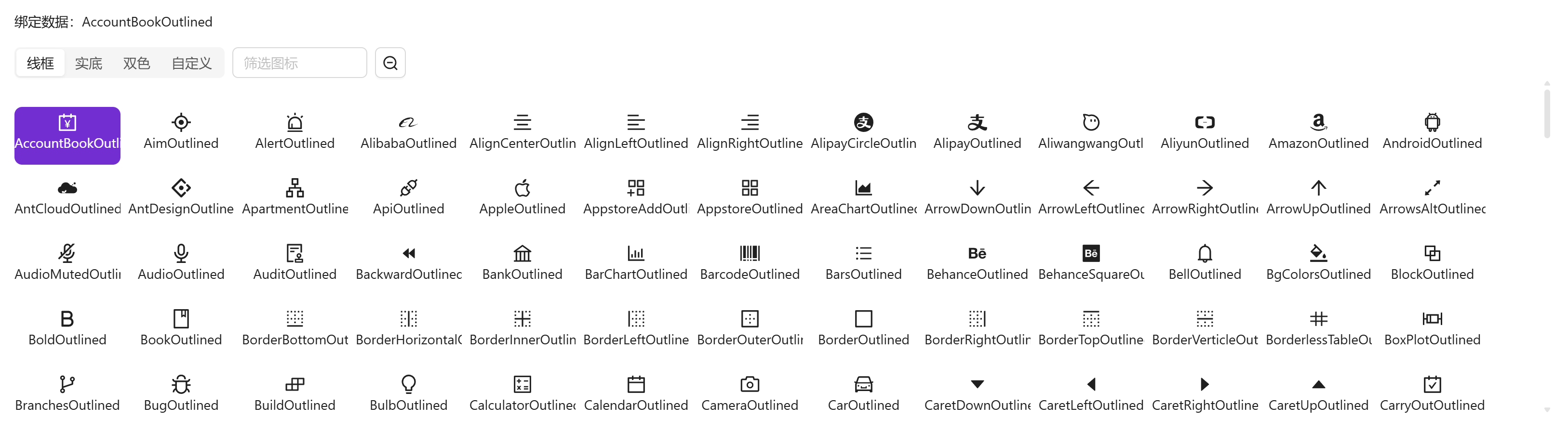
vue
<template>
  <a-typography-title :level="4">基础用法</a-typography-title>
  <a-typography-text>绑定数据:{{value}}</a-typography-text>
  <icon-select v-model="value"/>
</template>

<script setup lang="ts">
import IconSelect from "@/components/icon-select/index.vue"
import {ref} from "vue";
const value = ref<string>()
</script>
大号组件
通过size属性可修改组件中图标大小,以适应不同容器

vue
<template>
  <a-typography-title :level="4">大号组件</a-typography-title>
  <a-typography-text>绑定数据:{{value}}</a-typography-text>
  <icon-select v-model="value" size="large"/>
</template>

<script setup lang="ts">
import IconSelect from "@/components/icon-select/index.vue"
import {ref} from "vue";
const value = ref<string>()
</script>
小号组件
小号组件隐藏了组件名称,适合在 a-popover 等小型弹窗下使用
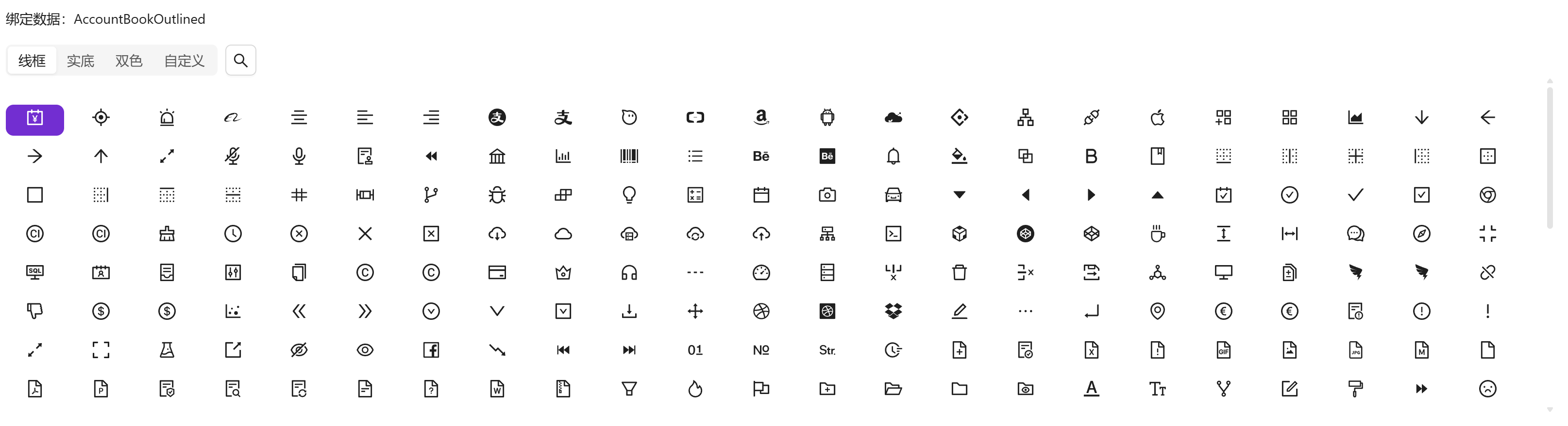
vue
<template>
  <a-typography-title :level="4">小号组件</a-typography-title>
  <a-typography-text>绑定数据:{{value}}</a-typography-text>
  <icon-select v-model="value" size="small"/>
</template>

<script setup lang="ts">
import IconSelect from "@/components/icon-select/index.vue"
import {ref} from "vue";
const value = ref<string>()
</script>
取消选中
再次点击已选中的图标即可取消选中(update:modelValue 回写 null)
API
双向绑定
| 属性名称 | 描述 | 类型 | 默认值 | 是否必填 |
|---|---|---|---|---|
| v-model | 双向绑定的图标名(图标包导出名) | string | - | 是 |
属性
| 属性名称 | 描述 | 类型 | 默认值 | 是否必填 |
|---|---|---|---|---|
| maxHeight | 图标区最大高度(例:400px) | string | '350px' | 否 |
| width | 组件宽度(例:100%) | string | '100%' | 否 |
| size | 尺寸档位,驱动图标格与字号的三档几何 | small | large | default | default | 否 |
事件
| 事件名称 | 描述 | 回调参数 |
|---|---|---|
| click | 点选/取消图标时触发 | 选中的图标名(取消时为 null) |